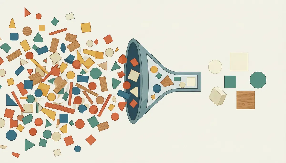
Responde a:How much does the conscious minimalism protocol measurably and quantitatively reduce client decision fatigue when applied to interior design?Media
Hipótesis:Reducing options decreases cognitive load and accelerates decision-making.
Evidencia esperada:Experimentos con usuarios, tiempos de decisión, encuestas y pruebas A/B.
Planted:July 7, 2026
Last evolution:July 21, 2026

Abstract

Minimalism is almost always sold as aesthetic taste: clean lines, little color, lots of emptiness. But the real reason why a space with fewer objects feels better is not visual — it's neurological. This node documents conscious minimalism as a decision protocol: a deliberate system to reduce the number of decisions that a space, a piece of furniture, or a workflow demands from the brain, applying the same principle we already use in the Espacios Plus workshop and in the data architecture of the Hub Soberano. With evidence from behavioral neuroscience, not just style.

Why "less is more" is not a pretty phrase — it's a measurement

There is an uncomfortably famous experiment in judicial psychology: researchers from the Proceedings of the National Academy of Sciences followed parole judges for months and found that the probability of them approving a request dropped from about 65% to almost 0% as the day progressed — and rose again after each lunch break. The files did not change. What changed was how many decisions that brain had made that day.

That phenomenon is called decision fatigue: the quality of our choices deteriorates with each additional decision because the brain treats willpower and self-control almost like a muscle that gets tired (Baumeister et al., 2018). A recent study using functional magnetic resonance imaging confirmed that there are specific brain regions that literally become overloaded when the number of options increases — it's not a metaphor, it's measurable neuronal activity in response to what is called choice overload.

Analogy: imagine the brain as the battery of a drill. Each decision — what shirt to wear, in what order to make the drawers, whether to respond to that message now or later — drains a bit of charge. By noon, if you've made a hundred small decisions, you have less battery left for the decision that really matters: closing that contract, finishing that piece of carpentry, writing the difficult email. Conscious minimalism is not about "having fewer things for pleasure" — it's about stopping the drain on battery for decisions that don't deserve your energy, so you have more available when it really matters.

The protocol, not the aesthetics

A well-designed minimalist space or system answers a single question, applied to each element: Does this require the user to make a decision they shouldn't have to make?

This translates into three design rules that we already apply, without naming them as such, in different areas of the portal:

1. Reduce the visible choice set, not the actual set. Companies that understand this best do not eliminate options — they hide them until needed. Netflix does not show you its 15,000 titles: it shows you 10 curated categories. In Espacios Plus, a well-designed multifunctional piece of furniture does not eliminate functions — it hides them behind a single gesture (open, fold, rotate) until they are needed. The reduction of cognitive friction cited in consumer behavior research shows that actively curating the set of options reduces overload without taking away real autonomy from the person.

2. Every visible object or field must justify its presence with a function, not with "just in case." This is literally the same principle we have already documented in the node on design for small spaces: a piece that does not serve an active function is, for the brain, a pending decision disguised as furniture. The same applies to a web form with 12 fields when only 4 are essential, or to a dashboard with 30 metrics when the user only needs to make a decision with 3 of them.

3. The most important decision of the day should happen first, not competing with a hundred trivial decisions. This is the finding behind Steve Jobs or Mark Zuckerberg's habit of wearing the same type of clothing every day — not vanity, but a deliberate saving of cognitive battery for the decisions that do matter. In business terms: if your client has to decide between 8 service plans before they can decide whether to hire you, you've already lost half of their decision energy before reaching the real point.

The commercial cost of ignoring this

This is not just user well-being — it's money on the table. A 2025 study on cart abandonment in e-commerce found that decision fatigue acts as a direct mediator between choice overload and the decision to abandon the purchase: the more alternatives a person sees before paying, the more likely they are to close the tab without buying anything — not because they stopped liking the product, but because they ran out of energy before reaching the payment button.

Translation to pricing and commercial proposals: a table of 6 plans with 15 features each is not "giving options" — it's charging your prospect cognitive energy before charging them money. Companies that simplify their offering to 3 clear options with one recommended by default are not "limiting" the customer — they are leaving enough battery for them to reach a yes. It's the same logic by which in Espacios Plus we quote with a recommended package first, not with a catalog of 40 possible combinations.

Where this same principle already lives in the portal, without having named it

  • In Espacios Plus: every piece of multifunctional furniture follows rule 2 to the letter — nothing exists "just in case."
  • In the Hub Soberano: filtering by visitor profile (already documented as a concept in the graph) is rule 1 applied to web architecture — reducing what the visitor sees, not what the system can do.
  • In the Rule of Three Axes: the logic that each axis has one clear role and does not compete for simultaneous attention is rule 3 applied to the architecture of an entire life.

This is not coincidence — it's the same decision architecture operating on different scales, from a drawer to a complete life model.

When minimalism becomes the opposite error

It's worth being honest about the limit: reducing options does not always help. When the reduction eliminates information that the person genuinely needs to decide well — not just to decide quickly — minimalism stops being a protocol and becomes opacity. A form with 4 fields that hides important contract conditions is not conscious minimalism: it's manipulation with a clean aesthetic. The difference between the two — developed in more detail in the neuromarketing node — is whether the design continues to work just as well when the user knows exactly what is being hidden and why.

What is still unresolved

We do not yet have our own metric that measures how much decision fatigue is reduced in minutes or hours for a client when we implement this protocol in a n8n flow or in a piece of Espacios Plus furniture. The evidence cited here comes from external studies applied by reasoned analogy, not a replicated experiment in our projects. It is the next logical step for this node when we have enough documented cases.

Cited sources

The Cognitive Graph
Ramificaciones futuras

Preguntas abiertas del catálogo que este nodo toca o ayuda a responder. Click en una para ver todos los nodos del jardín que la exploran:

Urgent For a limited time

A "half-broken" piece of furniture or structure in your Airbnb costs 4× more in negative reviews than fixing it on time.

Design my structure →
Data Verified data

Projects with prior 3D modeling reduce manufacturing errors by 80% and material waste by 30%.

View technical cases →